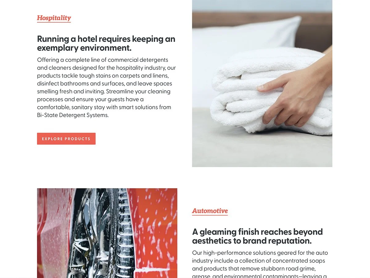
We recently partnered with Aligned Family, a new organization based in Chicago, to build a complete visual identity and online presence from the ground up.
Our primary focus was establishing a strong, memorable visual foundation for Aligned Family. To achieve this, we started with logo development, crafting a distinctive mark that represents their mission. From there, we developed a cohesive set of branding elements—colors, fonts, and a visual style—to ensure a unified look across all their materials. This initial phase also included the design of the founder’s business card, giving him a professional piece to share at networking events.
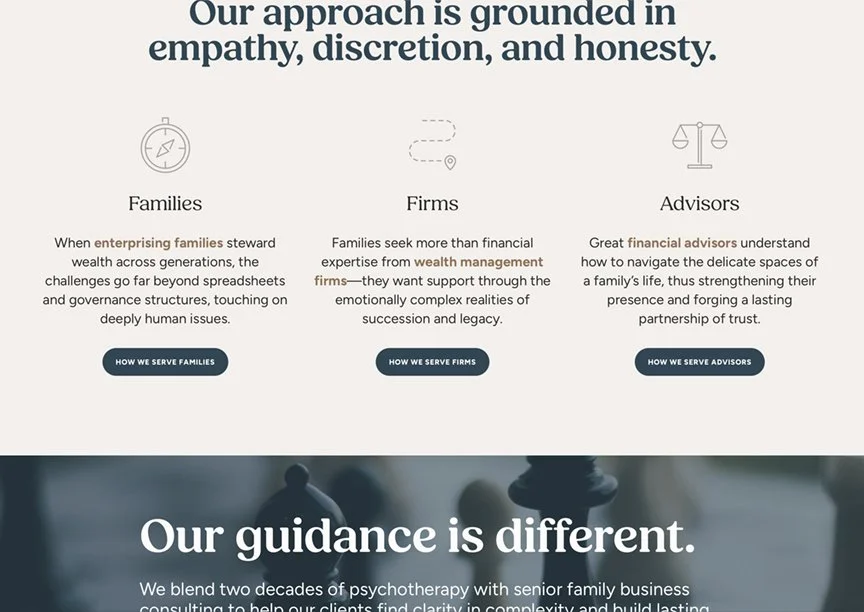
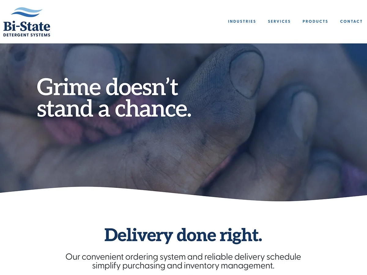
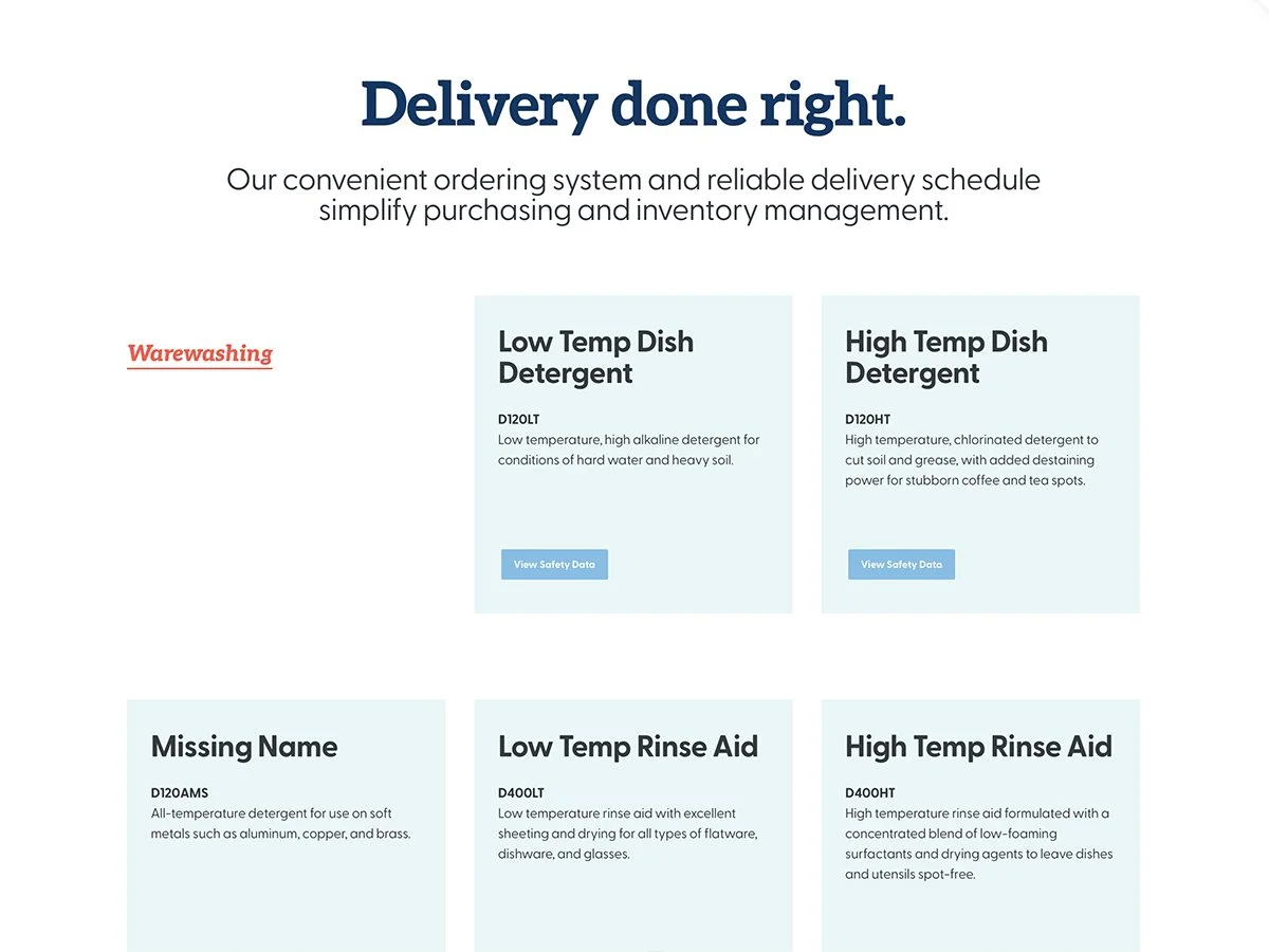
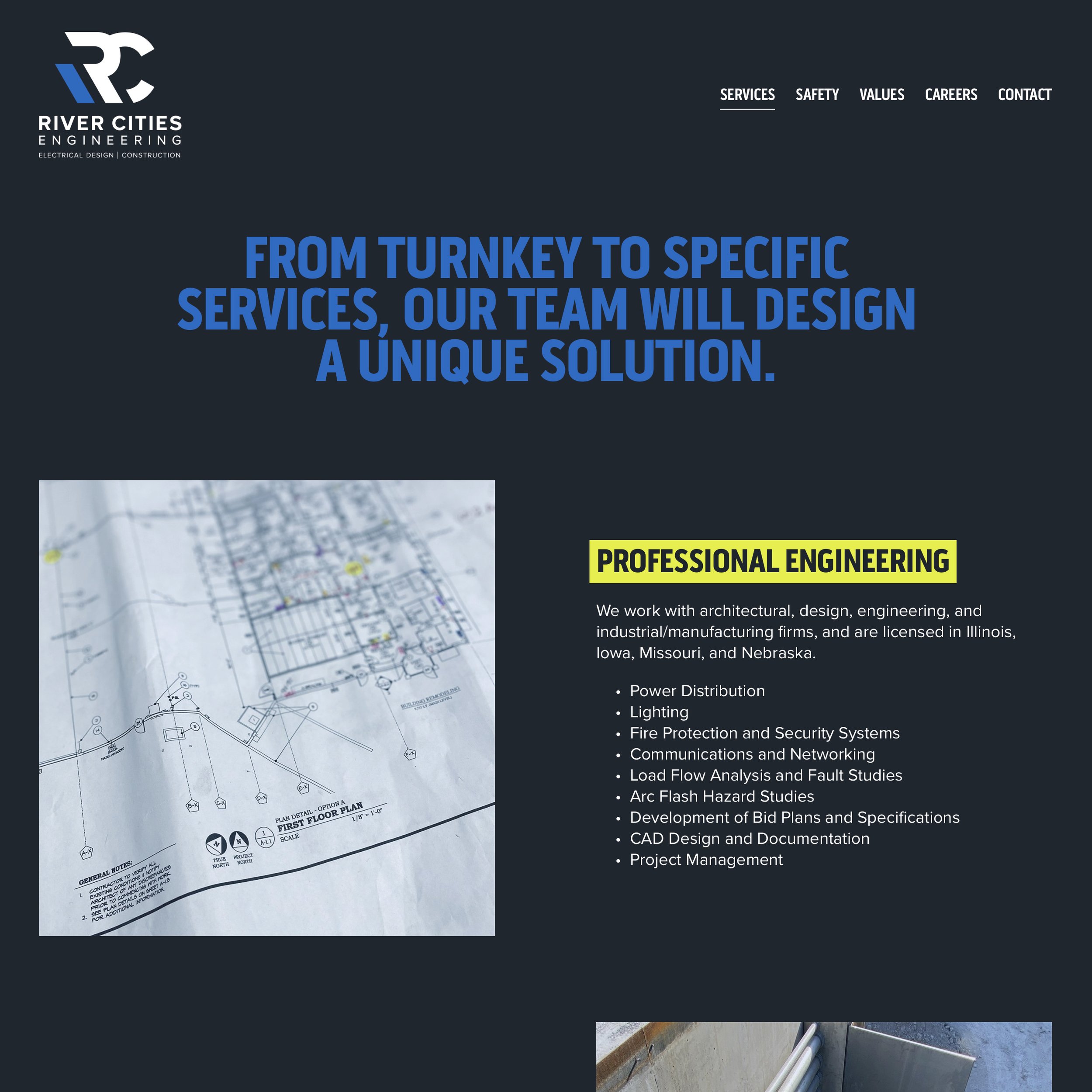
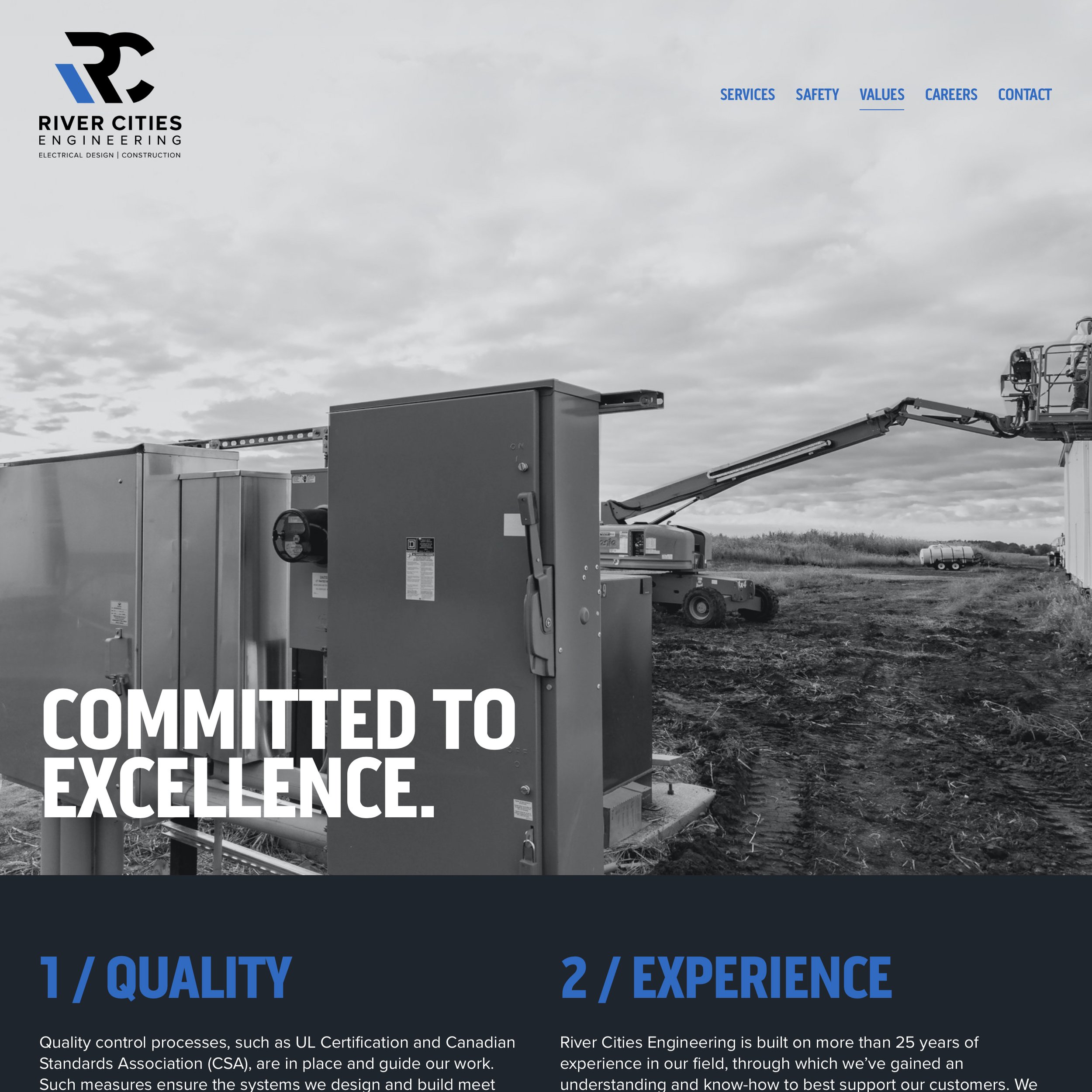
The culmination of our work was the design and development of Aligned Family’s new website.
It’s been a rewarding process to help the brand go from concept to a fully functional site that’s ready to serve families, firms, and advisors. Congratulations to Aligned Family on their new endeavor!